UX/UI Design 2025 - 2026

Despex

I structured a corporate expense management app that guides users from entry to expense report follow-up, connecting advances, receipts, and reports in a clear mobile journey.

Despex case hero with product visual composition
2. Project Snapshot

A mobile app designed to organize the full corporate expense cycle.

Client · Despex / A2W Sector · Corporate expense management Platform · Mobile app

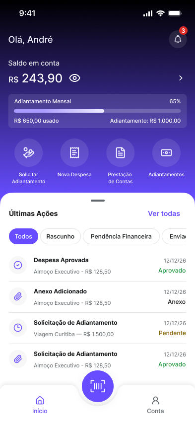
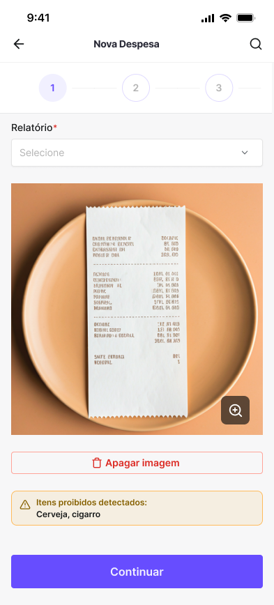
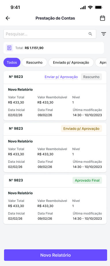
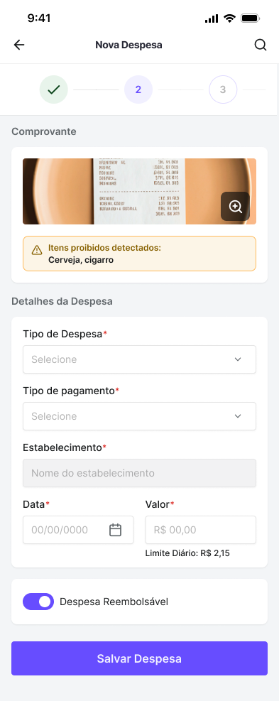
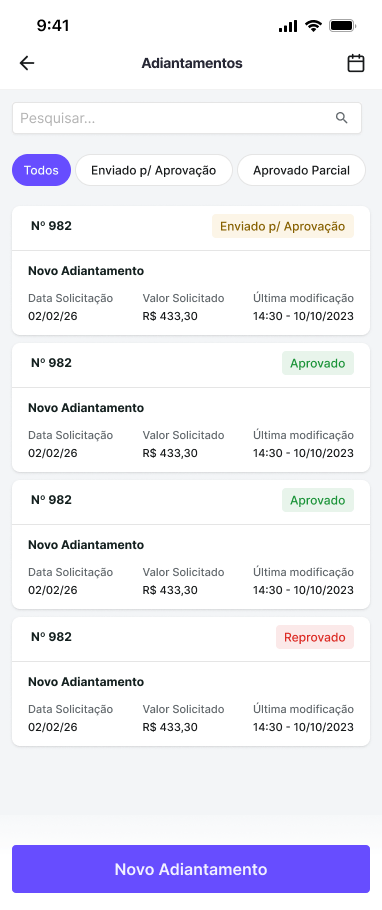
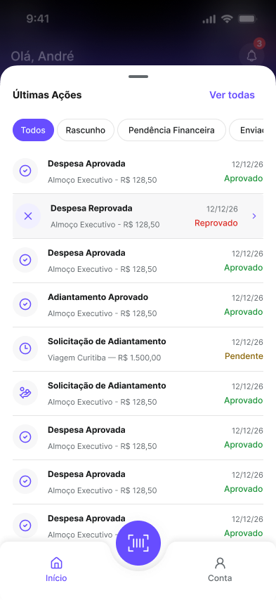
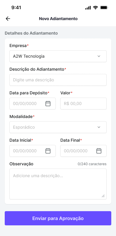
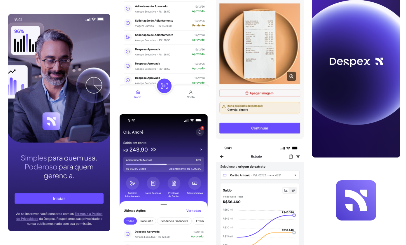
Despex was conceived as an app for registering, tracking, and managing business expenses, including advances, expense reports, and financial reports. The product proposal is not just to solve expense input: it organizes the entire path until structured information is returned to finance.

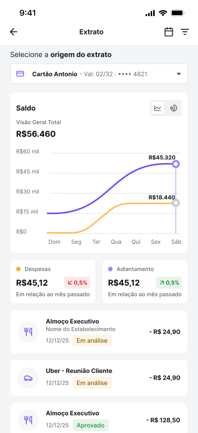
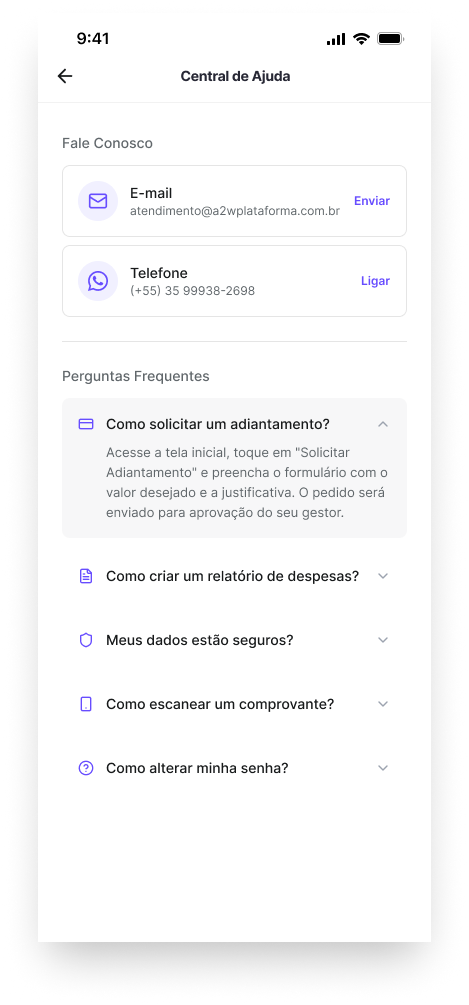
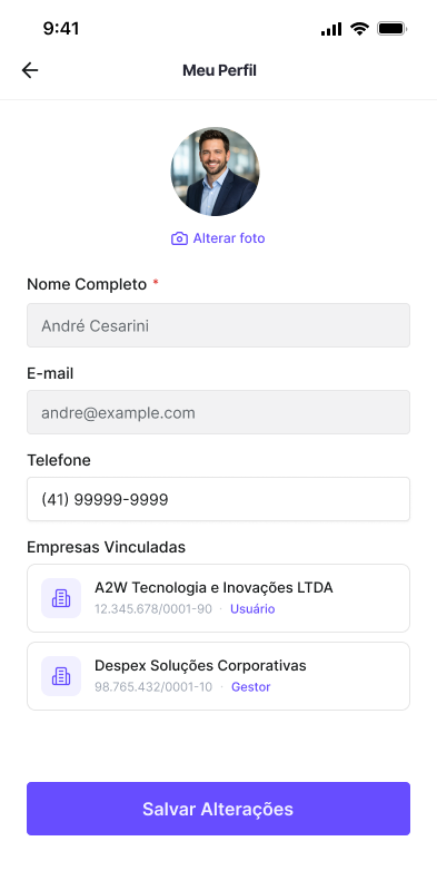
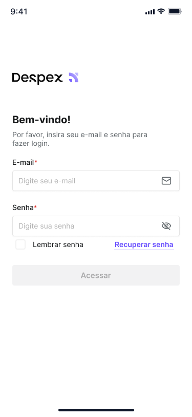
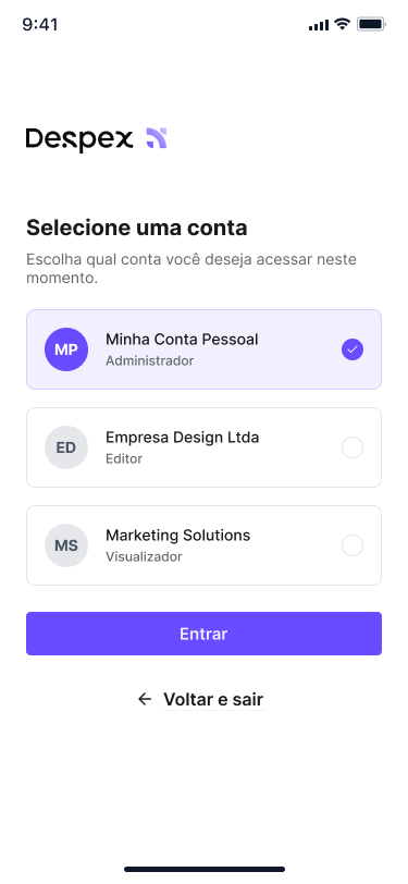
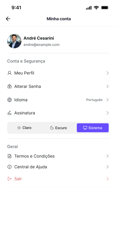
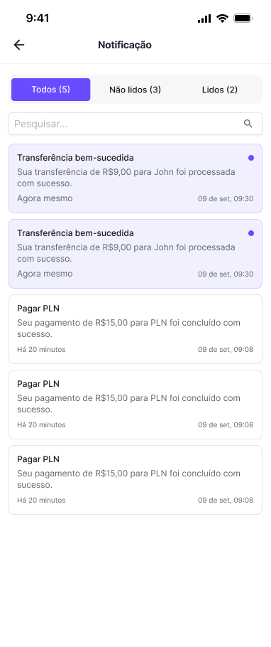
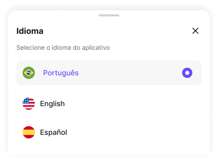
In Despex, this appears through an architecture that connects access, home, statement, expense entry, expense reports, advances, notifications, help, language, and my account into one product narrative.

My Role
Product Designer (UX/UI)
Status
Product prototype documented in Figma
Period
Not documented in the analyzed source file
Team
Me + product stakeholders + development
Activities
Flow Mapping Information Architecture UX/UI Design Prototyping Components Handoff
10
Visible mobile blocks in the app, from account access to the help area.
2
Visible construction layers in the file: flow structure and final interface.
3
Languages covered in the app: Portuguese, English, and Spanish.
6
Main journeys visible in the screens: access, home, statement, expense, report, and advance.
3. The Problem

Corporate expense does not end with the receipt.
It needs to return organized to finance.

Despex needed to organize in a single app a cycle that usually gets lost across disconnected steps: access, wallet, expense entry, report, advance, and expense reporting.

The design challenge was not only to create screens for registering expenses. It was to turn an operational and documentary routine into a clear, fast, and reliable mobile journey, able to reduce friction for the user and preserve the structure finance needs to receive.

An important point in the product architecture appears right in the access flow: there is no open signup. The app starts from an account provisioned by the company. This changes the experience logic: instead of selling the product to the end user, the interface needs to get them operational with as little friction as possible.

4. Research & Insights

Before the final UI, the project was solved as a flow.

Reading the file shows that the app was organized as a sequence of connected mobile journeys. The screens cover access, financial reading, expense entry, expense reporting, advances, and settings, without relying on loose modules or parallel paths.

The support areas help reveal the product's maturity. The Help Center answers questions about advances, reports, receipt scanning, security, and password. Terms appear in the access stage, and the language selector confirms the app's readiness for broader corporate use.

If the embed does not load inside this local page, open it directly in Figma: open FigJam
The flow was reduced to the essential blocks: provisioned access, account validation, first access, central dashboard, report creation, new expense, receipt with OCR, and return to the operational hub.
Despex Help Center with frequently asked questions
The Help Center exposes the product's most critical tasks and reveals where the experience needed to be clearer.
User profile screen in Despex
The profile and account area shows the experience was designed for recurring use, with personal data and preferences inside the app itself.
Despex terms of use and privacy screen
The terms enter the access journey and reinforce the formal scope of the service at the beginning of the experience.
Insight 1
The experience was structured as a continuous journey, not a collection of screens.
The app organizes access, financial reading, entry, and follow-up within the same usage logic, without breaking the operation into isolated flows.
Insight 2
The receipt is part of the task core.
In the detailed flow, the new expense journey connects image or PDF capture, processing, OCR, and review. The receipt structures the entry.
Insight 3
Support, communication, and account are not accessories in this product.
Help, notifications, language, profile, and terms appear as real parts of the experience, expanding the app's consistency for recurring use.
5. Persona / Target User

Despex's core user is the person who needs to enter, track, and close expenses on the move.

The operational user
Employee who uses the app to register expenses, request advances, track balance, and close expense reports during the work routine.
Goals
Enter expenses without rework, attach receipts at the right moment, track wallet, balance, and movements, and close reports in an organized way.
Frustrations the product needed to eliminate
Keeping receipts outside the flow, losing visibility between expense, advance, and balance, and depending on parallel channels to ask questions or complete formal steps.
Secondary profile served by the architecture
Manager or finance team member who needs to receive structured information, validate expense reports, and maintain document traceability.
I chose to center the narrative on the operational user because they move through the largest number of visible steps in the file and benefit most from a well-connected mobile journey.
6. Process & Design Decisions

I started with the operation sequence and only then deepened the screens.

The design process appears in how the journeys were chained. Instead of solving the app screen by screen, the build starts from the most frequent moments of use: entering, checking balance, registering an expense, tracking reporting, and managing advances.

This was decisive for the project. Despex stops being read as a set of loose screens and clearly becomes a mobile product oriented around real tasks from the corporate routine.

Decision 1 - Reduce friction in corporate access
The problem
The app does not operate with open signup and needs to get the user into use quickly.
What I noticed
Login, password reset, and account selection needed to work as a lean and direct block.
My decision
Organize entry into a few clear steps, focused on authentication, recovery, and choosing the correct account.
Decision 2 - Turn the home into an action point
The problem
The user opens the app to act, not to browse corporate content.
What I noticed
In the app architecture, home is the central node that distributes the product's main tasks.
My decision
Concentrate the financial view and highest-frequency shortcuts on the home, making entries to statement, new expense, expense report, and advance clear.
Decision 3 - Put the receipt inside the expense journey
The problem
In financial products, receipt and textual data are often treated at separate moments.
What I noticed
This increases errors, forgetfulness, and rework for people in the operational routine.
My decision
Design a journey where receipt capture, OCR, and data review are part of the same entry task.
Decision 4 - Separate tracking and reporting by context
The problem
After registering an expense, the user still needs to track statements, advances, and reports.
What I noticed
Mixing everything into a single view would reduce legibility and increase tracking effort.
My decision
Distribute the operation across home, statement, expense reports, advances, notifications, and account area, keeping each task in its proper context.
7. The Solution

The result was a mobile app that covers entry, financial operation, and expense follow-up.

Despex was structured to cover what really happens in the corporate expense routine: entering, checking balance, entering expenses, gathering receipts, consolidating reports, requesting advances, submitting expense reports, and following the operation inside the app itself.

This gives the project depth. Instead of depending on a single hero screen, the solution shows a product that connects entry, follow-up, support, and account into a cohesive experience.

Access
Login, recovery, and account selection
Lean entry structure for a corporate app that starts from provisioned use.
Home
Dashboard with financial view and action shortcuts
The home screen concentrates balance, reading cards, and quick access to the most recurring tasks.
Statement
Movement reading and financial follow-up
The statement organizes inflows and outflows in a dedicated view, keeping the app's financial reading always accessible.
New Expense
Receipt capture, OCR, and review in one journey
The entry connects document and form inside the same flow, reducing rework.
Reporting & Advance
Specific flows to organize submission and value advance
The app separates expense closing and advance requests into dedicated journeys, with proper context for each task.
Account & Support
Profile, settings, and help integrated into recurring use
My Account and Help Center appear as native parts of the product, not as secondary areas.
Communication & Preferences
Notifications, language, and experience control
The product treats follow-up and usage preferences as part of the continuous mobile operation.
8. Key Features

Despex's strongest features are precisely the ones that connect operation and governance.

Provisioned access flow
The product makes clear from the architecture that it does not work with open signup. This simplifies entry and places the user directly in corporate app usage.
Operation-oriented home
The home screen organizes balance, shortcuts, and a quick read of what needs to happen next, reinforcing the app as a work tool rather than a corporate hub.
New expense with capture and processing
The flow connects receipt, OCR, and form, reducing the distance between registering the expense and documenting it correctly.
Reports and expense reporting
The app does not fragment expenses. It allows users to group, review, and submit information inside the experience itself.
Advances integrated into the wallet
The advance request appears as part of the user's same financial ecosystem, not as an isolated flow.
Trust layers inside the product
Help, language, terms, and my account appear as real parts of the experience, reinforcing support, understanding, and usage continuity inside the app.
9. Results & Learnings

The project gains strength when it shows process, scope, and closure.

Results
A product with mature and well-connected scope
The Despex project shows a product covering everything from entry to expense report closure. For the portfolio, this turns the presentation into something stronger than a set of screens: the project starts to evidence architecture, process, and product depth.
Learnings
In financial products, flow is worth more than an isolated screen
Despex's strength is in the connection between modules. Receipt, help, and support are also product design. When these elements enter the architecture early, the project gains operational density and makes clear that the project does not end at the dashboard.